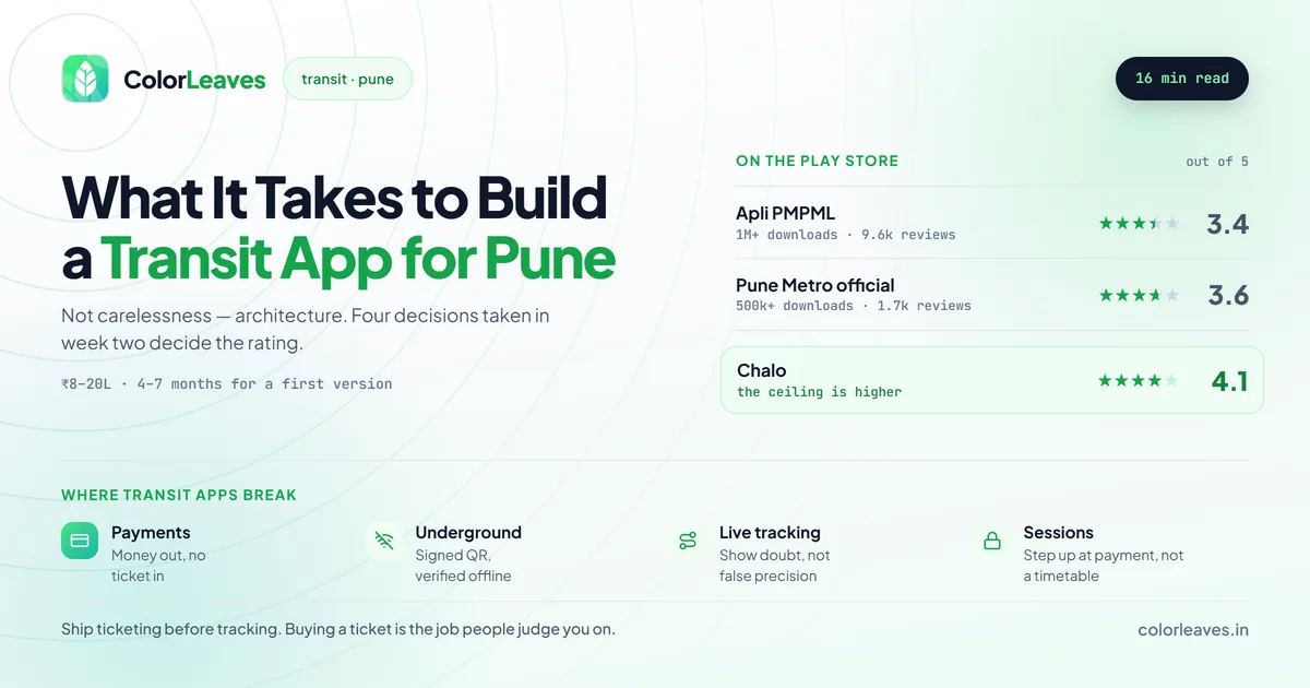
Two apps sit on the phones of a lot of Pune commuters. Apli PMPML, built by Chartr Mobility for the city bus service, has passed a million downloads and sits at 3.4 stars across roughly 9,600 reviews. The Pune Metro official app from Mahametro has crossed half a million downloads with 3.6 stars from about 1,680 reviews.
Neither rating is where anyone wants it. The easy conclusion is that the teams behind them didn’t do a good job.
That conclusion is wrong, and it’s worth explaining why, because the problems these apps run into are among the harder ones in mobile development. Chalo, which does a broadly similar job, manages 4.1 on the same store, so the difficulties are clearly solvable. But they’re solvable through specific engineering decisions that have to be made early, and if you’re planning anything in this space, these are the decisions worth getting right the first time.
We’ve read through the public reviews on both apps. The complaints cluster tightly, which is useful, because it points straight at the four things that actually break.
We build apps from Pune and we commute here, so this is written from both sides. None of it is a critique of the teams involved, and the last section says why.
Key Takeaway: Transit apps fail on four predictable fronts: payments that take money without issuing a ticket, functionality that dies where there’s no signal, live tracking that projects false confidence, and sessions that make users log in constantly. All four are design decisions made before a line of code gets written, not bugs to fix afterwards.
The Payment Problem That Nobody Gets Right First Time
The single loudest complaint across both apps is the same one. Money leaves the account and no ticket arrives. On the Metro app the most upvoted reviews describe exactly this, with one adding that once a grievance is raised there’s no way to check what happened to it.
Here’s why this is genuinely difficult rather than careless.
Buying a ticket looks like one action to the user. Underneath it’s a conversation between at least three systems: the app, a payment gateway, and the ticketing backend. Money moves in one system while the ticket is created in another, and there’s no shared transaction wrapping both. If the network drops in the gap, and on a crowded platform it will, the payment can succeed while the ticket creation never happens. Nobody wrote a bug. The design simply had no answer for that moment.
Every checkout has this shape, which is why the discipline transfers. An ecommerce app has the same gap between payment captured and order created, and the same answer. What makes transit harder is the conditions: the customer is standing at a gate with people behind them, on the worst connection they will encounter all day, and they cannot come back later.
The fix is a set of practices that are well understood and often skipped when a deadline is close.
Every payment attempt carries an idempotency key, a unique identifier generated by the app before the request goes out. If the app retries because it lost the response, the gateway recognises the key and refuses to charge twice. This one decision eliminates a whole category of duplicate charges.
Behind that, a reconciliation job runs continuously, comparing what the gateway says it collected against what the ticketing system says it issued. Anything that doesn’t match gets resolved automatically, either by issuing the ticket or refunding, within a stated window. The user should never be the mechanism that discovers the mismatch.
And the interface has to be honest about the in-between state. “We’re confirming your payment, this takes up to two minutes” is a fine thing to show someone. Silence is not, and neither is a success screen the system isn’t sure about. Most anger in those reviews isn’t about money being lost. It’s about not knowing what happened.
This is the same discipline any fintech build needs, and it’s the part where cutting corners costs the most trust. Our fintech cost guide covers what the payment and reconciliation layer actually costs to build properly, and the answer is more than most transit budgets allow for it.
One useful thing to know: a metro or bus ticket is a real-world service, so Apple’s 30 percent in-app purchase cut does not apply. You use a normal payment gateway. Teams occasionally implement in-app purchase here out of caution and get rejected for it, which is an avoidable delay on a launch that probably has a date attached to it.
Underground, With No Signal
A metro app has to work in the one place phones don’t. Platforms are below ground, tunnels have no coverage, and the moment a commuter most needs their ticket is the moment their connection is worst. Reviews of the Metro app mention it behaving badly on poor networks, which for this category is close to a definition of the problem.
Designing around it means the QR ticket has to be generated and verified without a live server call. That’s achievable with cryptographically signed tokens: the ticket carries its own proof of validity, the gate validates the signature locally, and reconciliation happens later when both sides have connectivity. The ticket exists on the device from the moment it’s bought, not fetched when it’s scanned.
Everything else follows the same rule. Fares, station lists, route maps and the user’s active passes get cached on the device and refreshed opportunistically. The app should open and be useful with the radio off. Anything that genuinely requires a connection should say so plainly rather than spinning.
We make the same argument about factory apps in Pune, where plant wifi dies near heavy machinery. Different setting, identical engineering. Offline is an architecture, decided at the start. It cannot be added later without rewriting most of the app.
Live Tracking Is a Data Problem, Not a Map Problem
The PMPML reviews are specific and consistent about tracking. Buses appear on the map with one route number and arrive showing another. Buses don’t appear at all and then turn up at the stop. Predicted timings are unreliable. The most upvoted review on the listing makes exactly these points, and it’s rated helpful by dozens of people.
Putting a moving dot on a map is the easy part. Everything upstream of that dot is where it gets hard.
GPS drifts in dense areas with tall buildings. Tracking hardware on a vehicle can be switched off, unplugged or simply broken, and no one on the software side finds out. Buses get reassigned between routes during a shift for entirely sensible operational reasons, so the vehicle reporting itself as route 134 may genuinely be running something else now. And predicting arrival time in Pune traffic is a forecasting problem, not a geometry one.
None of that can be fixed purely in the app. It needs data quality work at the source, on the vehicles and in the depot systems. Anyone who has built on-demand or delivery apps will recognise the problem, since live driver tracking runs into the same GPS and hardware realities, and our on-demand cost guide covers what the tracking pipeline costs on that side.
There’s an Android-specific version of this worth naming, because it is the most common cause of a vehicle going dark on the map. Background location is exactly the workload Xiaomi, Oppo, Vivo and Samsung power management kills first, often within minutes of the app leaving the foreground. If any part of your tracking depends on a driver’s phone rather than fitted hardware, that is the failure you will spend the most time on, and our piece on Android device fragmentation covers the mitigations and the device matrix that catches it.
What the app can do, and what separates the good ones, is stop projecting confidence it doesn’t have.
Show when a position was last updated. Show a range rather than a single minute when the confidence is low. Mark a vehicle as stale instead of leaving a dot sitting on a road it left twenty minutes ago. Users are surprisingly tolerant of “we’re not sure”. They are not tolerant of being told something confidently and finding out it was wrong while standing at a bus stop.
That’s a product decision more than a technical one, and it’s the one we’d argue hardest for. It also sits with design rather than engineering, because deciding how to show uncertainty is an interface problem, and interfaces that admit doubt are harder to design than interfaces that assert.
The Users Everyone Designs Around
Transit is not a discretionary product. Unlike a shopping app, the people using it have no alternative, and that changes who you are building for.
Language. A city bus in Pune carries Marathi speakers, Hindi speakers and English speakers, and a fare screen in English only excludes a meaningful share of the ridership. Multilingual support is not a version two feature here in the way it might be elsewhere. Build the string handling for it from the start, because retro-fitting localisation into an app whose layouts assume English text lengths is genuinely painful.
Age and familiarity. A large share of commuters are older, or new to smartphones, or both. The design instincts that suit a young urban audience, gesture navigation, hidden menus, minimal labelling, work against you here. Bigger targets, visible labels and fewer steps beat elegance.
Accessibility. Public transport serves people with visual and mobility impairments, and it is one of the categories where accessibility is closest to a duty rather than a nice-to-have. Screen reader labels on every control, sufficient colour contrast, and text that scales when the system font size is raised. None of this is expensive if it is done as you go, and all of it is expensive to add afterwards.
Hardware. Assume a four-year-old budget Android handset with 3GB of RAM, not the phone your designer carries. That is the actual device the actual user has, and it is the one your ticket QR has to render on instantly at a gate with people behind them.
All four of these are decisions taken during discovery and design rather than problems solved later, which our walkthrough of the development process covers in sequence. That is the recurring theme of this whole piece: the things that sink transit apps are architectural, and architecture is chosen in week two.
The Login Question
Several Metro app reviews complain about having to log in every time the app opens. It’s an easy thing to criticise and a less easy thing to solve well, because there’s a real reason behind it. The app holds payment methods and issues things of value. Long-lived sessions on a device that gets lent, lost or shared are a genuine risk.
The answer isn’t to choose between security and convenience. It’s to separate them. A refresh token can keep someone signed in for weeks while the app still demands a fresh check at the moment it matters, which is payment. Biometric re-authentication handles that in under a second, so the sensitive action is protected without punishing someone who just wants to look up a fare.
Making the user prove who they are in order to read a timetable protects nothing. Step up the authentication where the risk actually sits.
What the Data Safety Labels Say
There’s a detail on both listings that most people scroll past, and it’s worth a look because Google puts it in front of every prospective user.
Apli PMPML declares that data is encrypted in transit, and also that data can’t be deleted. The Pune Metro app declares the reverse: users can request deletion, but data isn’t encrypted in transit.
Each has one half of the pair right. Taken together they’re a neat illustration of how these labels drift out of step with what an app should be doing, particularly with India’s Digital Personal Data Protection Act pushing deletion rights toward being a baseline expectation rather than a nice extra. Encryption in transit, meanwhile, has been standard practice for years and is close to free to implement.
These declarations are written by the developer, and they’re often filled in once during a release and never revisited. If you’re shipping an app, they’re worth an annual look, because they’re read by users deciding whether to install and increasingly by people with a compliance interest.
Worth knowing that Google cross-checks these against what the app actually does. Declaring that you don’t collect location while the code requests location permission is a rejection, and the form catches more developers than the content rating does because people forget their analytics SDK counts. Our Play Console guide covers filling it in properly, and the annual review belongs in whatever maintenance arrangement covers the app, alongside the target API bump that Google enforces every year.
What Good Looks Like Here
Chalo runs at 4.1 across the same category, which tells you the ceiling is higher than 3.4 or 3.6. Looking at what tends to separate the better transit apps, it isn’t feature count. It’s that the core loop, find your service and pay for it, works every single time under bad conditions.
That’s an unglamorous kind of quality. It doesn’t demo well and it’s hard to put on a feature list. It’s also the entire basis on which people rate these apps, because a commuter uses one function twice a day and judges the whole product on whether it worked.
If You’re Building Something in This Space
A short list of what we’d insist on from the start.
Design the failure paths before the happy path. What the user sees when the payment is uncertain matters more than what they see when it works.
Treat offline as the default state and connectivity as the exception. It’s much cheaper to relax that assumption later than to introduce it.
Never show confident data you can’t stand behind. Timestamps and ranges beat false precision.
Build reconciliation and automatic refunds on day one, with a stated resolution window. Then say what that window is inside the app.
Test on a four-year-old budget Android phone on a throttled connection, not on the newest device on office wifi. That’s the actual environment. Building a device matrix of five or six handsets that reflects your actual ridership costs less than one round of post-launch firefighting.
And put a real support path in the app, with a reference number and a status the user can check. A large share of one-star reviews on both apps are about not being able to find out what happened, rather than about the original failure.
That last point has a staffing consequence people miss. A ticketing app generates support load in a way a content app does not, and somebody has to answer it within a stated window. Decide before launch whether that sits with the operator, with your development partner under a defined support arrangement, or between the two, because “we’ll work it out” becomes a queue of unanswered grievances inside a month.
Common Questions
How much does a transit or ticketing app cost to build? A focused ticketing app with payments and offline QR generally runs ₹8 to 20 lakhs depending on the integrations. Live vehicle tracking adds meaningfully to that, because the hard cost sits in the data pipeline and the depot side rather than in the app. Our Pune cost comparison covers general ranges, and the India-wide cost guide breaks pricing down by feature.
How long does it take? Four to seven months for a first version that handles payments and offline tickets properly, which our development timeline guide puts against other categories. Rushing the payment reconciliation to hit a launch date is the most expensive shortcut available in this category. Add slack for store review at the end, since Apple rejects roughly a quarter of submissions and a public launch date is exactly the situation where that hurts.
Can one app cover buses and metro? Technically yes, and commuters clearly want it. The obstacle is usually organisational rather than technical, since it needs two operators to agree on fare handling, revenue splits and support ownership.
Should it be native or cross-platform? Either works here. Cross-platform development covers both platforms from one codebase and suits most ticketing apps, while native Android is worth considering if you need deep integration with payment hardware or NFC cards. Flutter versus React Native covers the framework choice, and either a Flutter or React Native team can do this provided somebody can write native code, since offline storage and background location both sit close to the platform. Don’t skip iOS entirely: it is a minority of the ridership and disproportionately the people writing about your app.
How do we keep the first version small? Ship ticketing before tracking. Buying a ticket reliably is the job people judge you on, and live tracking is the harder half. That staged approach is the same thinking behind an MVP build, and our MVP costing guide covers scoping a first version that proves something.
What’s the hardest part? Payments under unreliable networks, without question. Everything else has a well-trodden solution.
How do you test offline behaviour properly? Not with a wifi toggle. You need network conditioning that simulates high latency and packet loss, plus deliberate mid-transaction kills, on real devices. Airplane mode tests the easy case and misses the failures that actually happen. Then get builds onto real commuters’ phones through a Play internal testing track and ask them to buy a ticket on an actual platform, because the only honest test of an underground app is underground.
Who should we get to build it? Somebody who has shipped something with payments and unreliable connectivity, rather than somebody with a large portfolio of straightforward apps. Ask what they did about payment reconciliation on their last build, and ask what happened the first time a payment succeeded without a ticket. Our guide to choosing a development company covers the wider selection process, and hiring an app developer in Pune covers the local market if you want a team you can sit with.
Why We Wrote This
We build apps in Pune, and we use these apps like everyone else here. Nothing above is meant as a shot at the teams involved. Both apps do things well, both are shipping updates, and the problems they’re wrestling with are the ones that make this category difficult in the first place.
If you’re planning something with real-time data, payments over patchy connections, or offline requirements, those are the areas where a build goes wrong quietly and expensively. Our case study on StockGenie covers a project where getting real-time data right was the bulk of the work. If you want to talk through an idea in this space, get in touch.